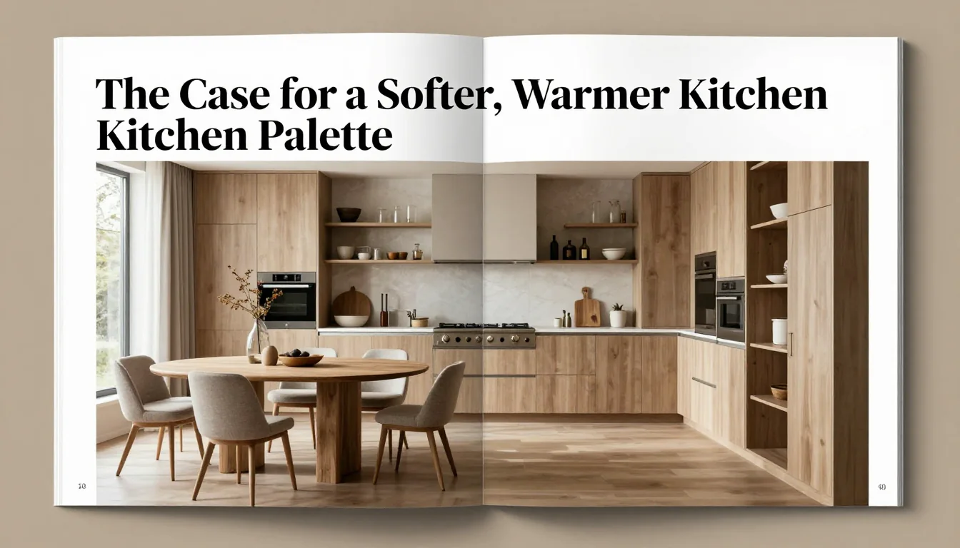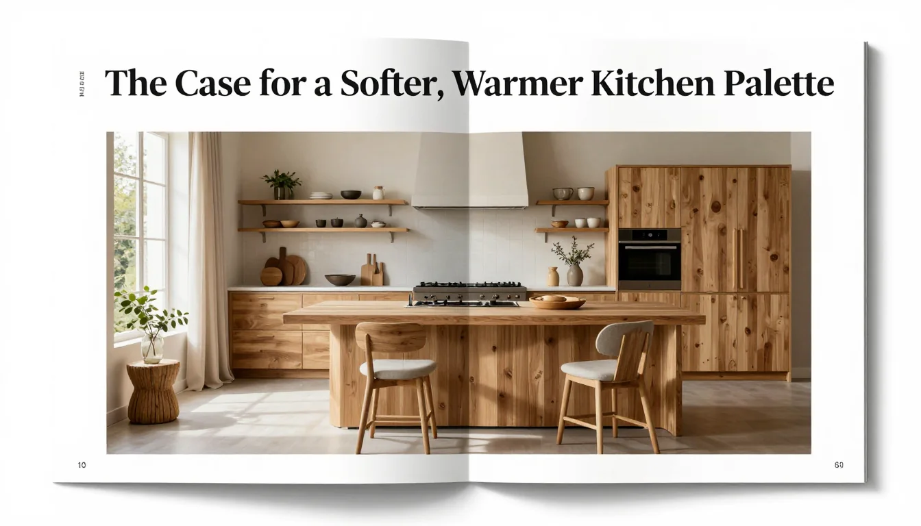
In an era where ultra-minimalist design often favors stark white expanses and high-gloss finishes, there is a growing movement toward kitchens that feel less like showrooms and more like the heart of a home. The modern kitchen should be a place of gathering, creation, and comfort—a space that feels deeply rooted in its surroundings. For many homeowners seeking longevity over fleeting trends, achieving this sense of permanence requires moving away from high-contrast drama and embracing subtlety. It is through the thoughtful combination of muted colour palettes, the grounding warmth of natural timber, and the timeless texture of stone that a kitchen can transcend temporary design fads, becoming an enduring sanctuary.
This approach celebrates imperfection—the subtle veining in marble, the gentle grain of reclaimed wood, the soft shift in hue from sage to taupe. These elements work together not just to decorate, but to ground the space in authenticity, giving it a rich, lived-in patina that only deep time can provide.
Finding a Quiet Starting Colour
The foundation of any harmonious kitchen lies in its initial colour selection. Rather than opting for bold statements or clinical whites, the most enduring designs begin with an intentionally quiet hue—a tone that acts as a sophisticated backdrop rather than a focal point. Consider soft neutrals drawn from nature: dusty sage greens, warm mushroom greys, pale oatmeals, or deep, smoky blues. These muted shades possess enough depth to feel substantial without ever appearing heavy.
When selecting this primary colour for cabinetry or large tiled areas, the goal is not simply camouflage, but integration. The chosen tone should harmonize with the natural light entering the space and reflect the ambient colours of the surrounding architecture. This careful curation ensures that even when the room is empty, it retains a feeling of calm equilibrium.
To prevent a muted palette from becoming monotonous, introduce variations within the same colour family. Pairing a soft grey base cabinet with an island painted in a deeper, warmer taupe creates subtle visual interest. These nuanced shifts allow the eye to wander and discover depth, transforming what might be a flat surface into a layered composition.
Balancing Hard Surfaces With Warmth
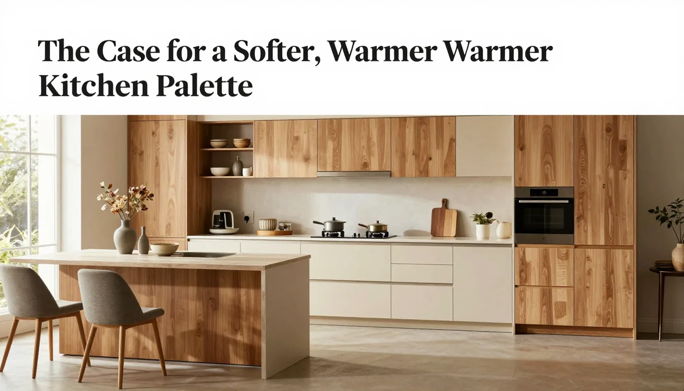
A high-end kitchen inevitably incorporates hard surfaces—the cool resistance of quarried stone countertops, the sleekness of porcelain backsplashes. While these materials lend an undeniable sense of luxury and durability, they carry the risk of making a space feel cold or sterile if not managed correctly.
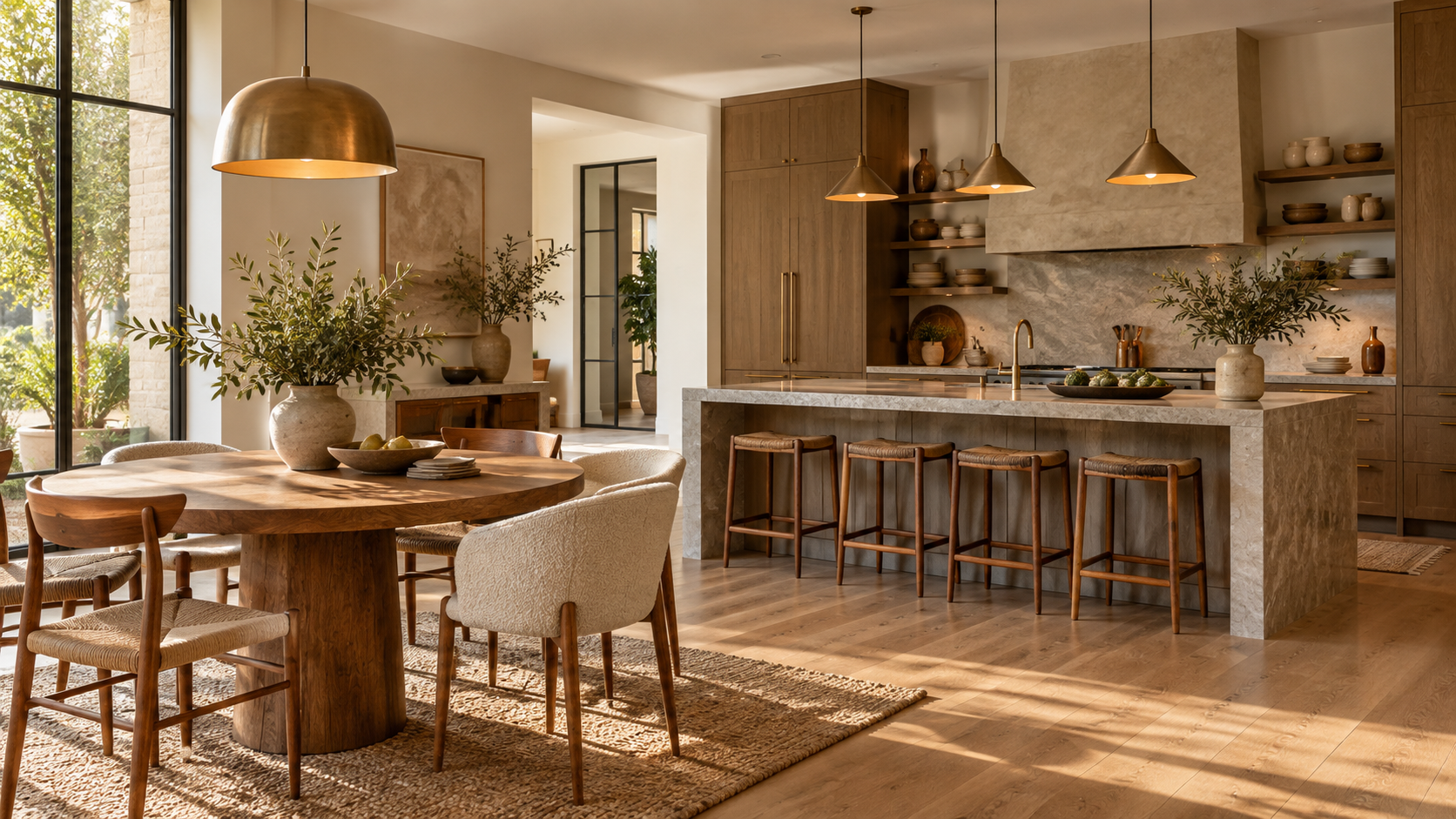
The secret to balancing this inherent coolness is the strategic introduction of timber. Timber serves as the crucial counterpoint: its organic grain, inherent warmth, and deep texture inject life into the geometry of stone. Whether used for open shelving, continuous island seating, or custom millwork framing the range hood, wood introduces a tactile element that invites touch.
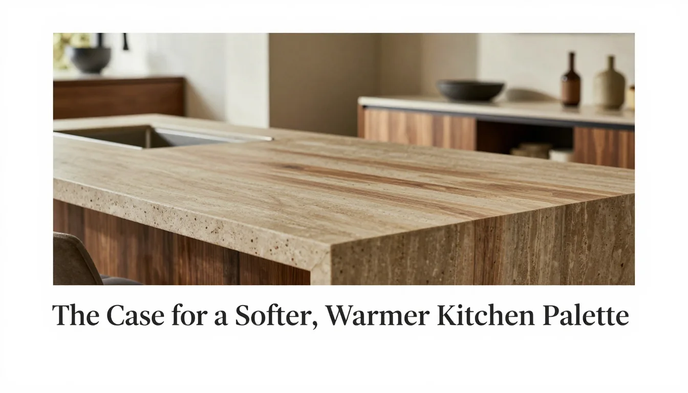
Furthermore, select stones not just for their pattern, but for their temperature. While dramatic black marble is beautiful, softer limestone or honed slate offers a matte finish and a more subdued colour story. These less polished surfaces absorb light rather than reflecting it harshly, contributing to the overall sense of intimacy and permanence that defines this aesthetic.
Extending the Palette Into the Dining Area
The kitchen should never exist as a siloed functional space; its design language must flow seamlessly into adjacent areas, particularly the dining room. This continuity is what truly makes a home feel unified and deeply considered.
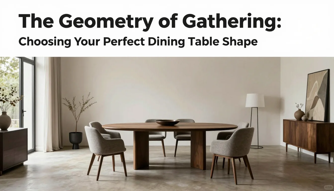
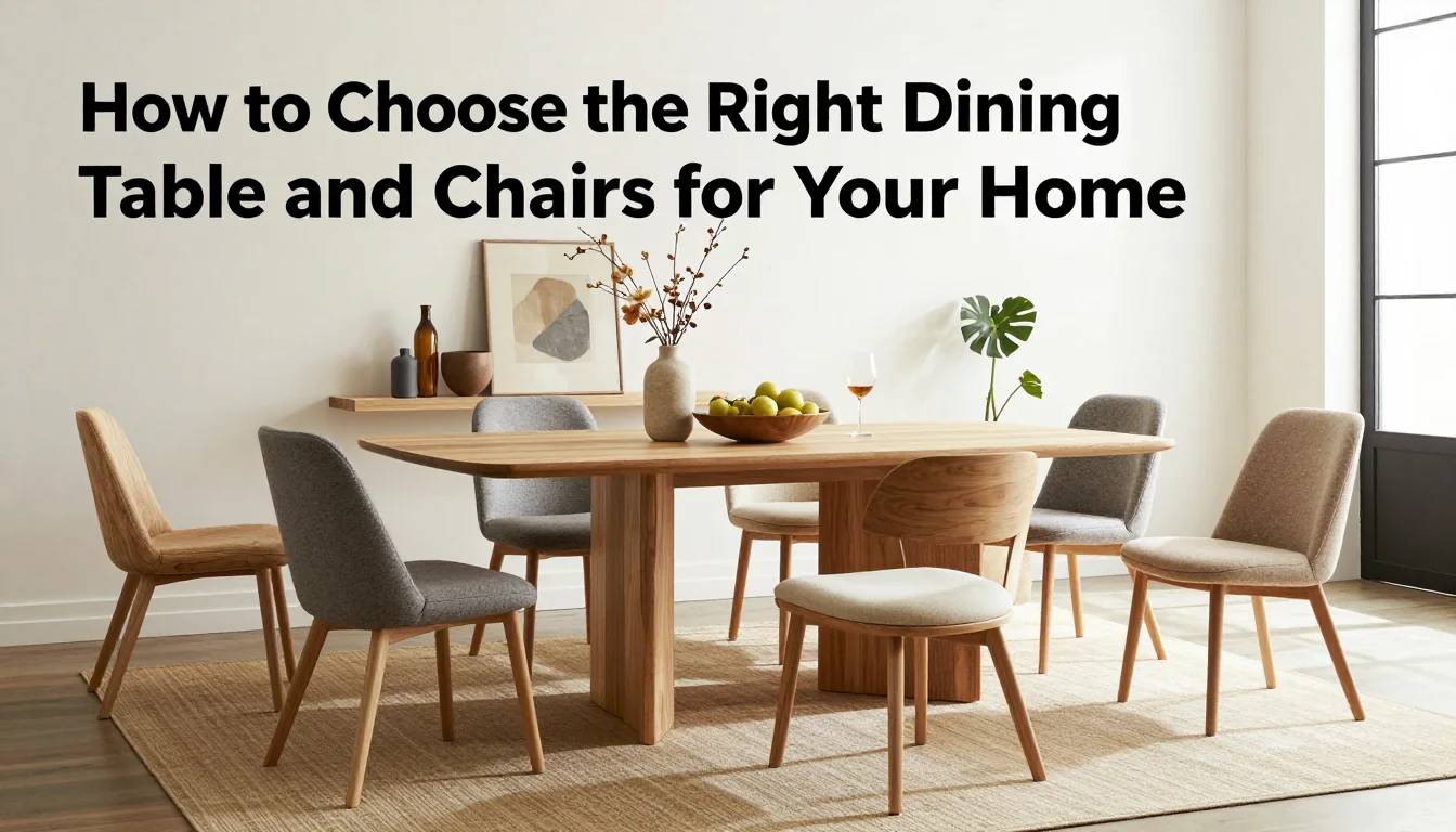
When carrying the palette forward, maintain consistency in the material story rather than replicating every element exactly. If your kitchen utilizes a specific shade of aged oak for its island base, echoing that wood tone on the dining table or banquette ensures visual cohesion. Similarly, if soft sage was chosen as the cabinet colour, allowing it to appear subtly in an adjacent wall treatment creates a gentle, uninterrupted journey through the home.
This subtle extension prevents the kitchen from feeling like an isolated zone of activity. Instead, the muted palette and natural textures become the guiding narrative of the entire open-plan area—a cohesive story told through stone, wood, and quiet colour that speaks to comfort and enduring style.