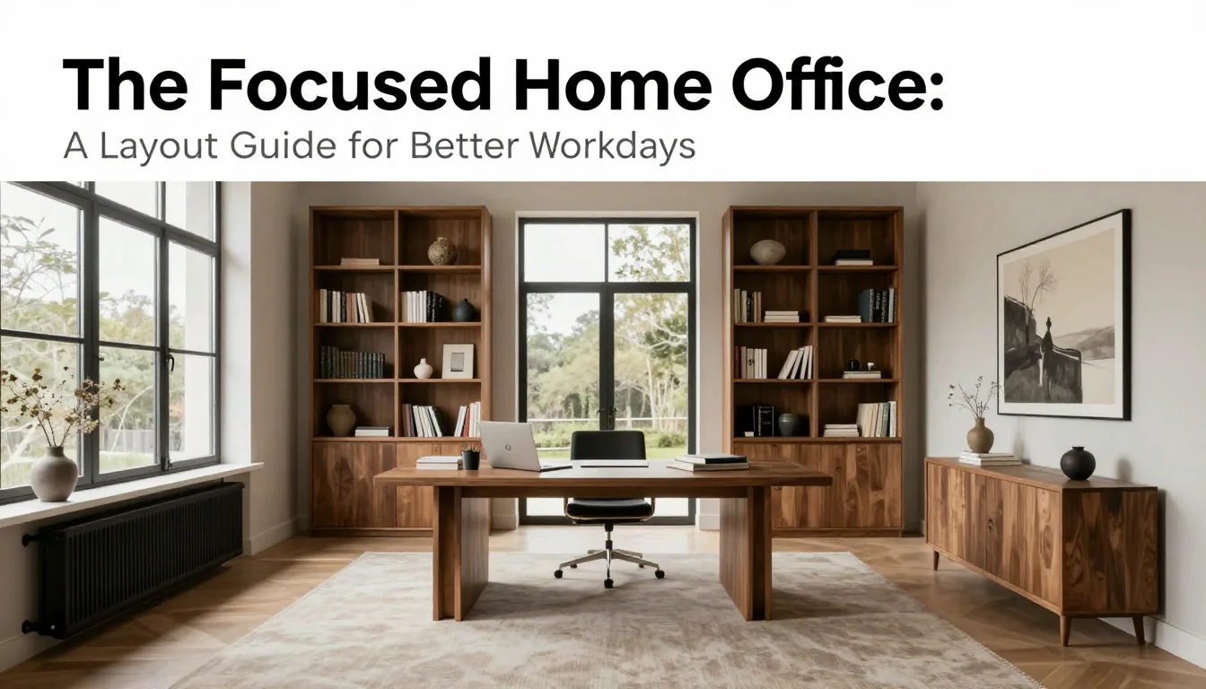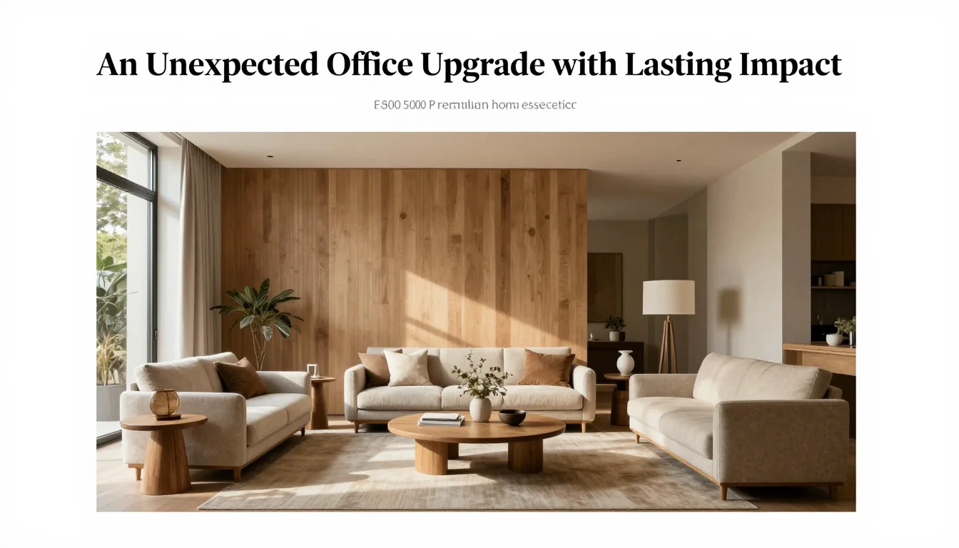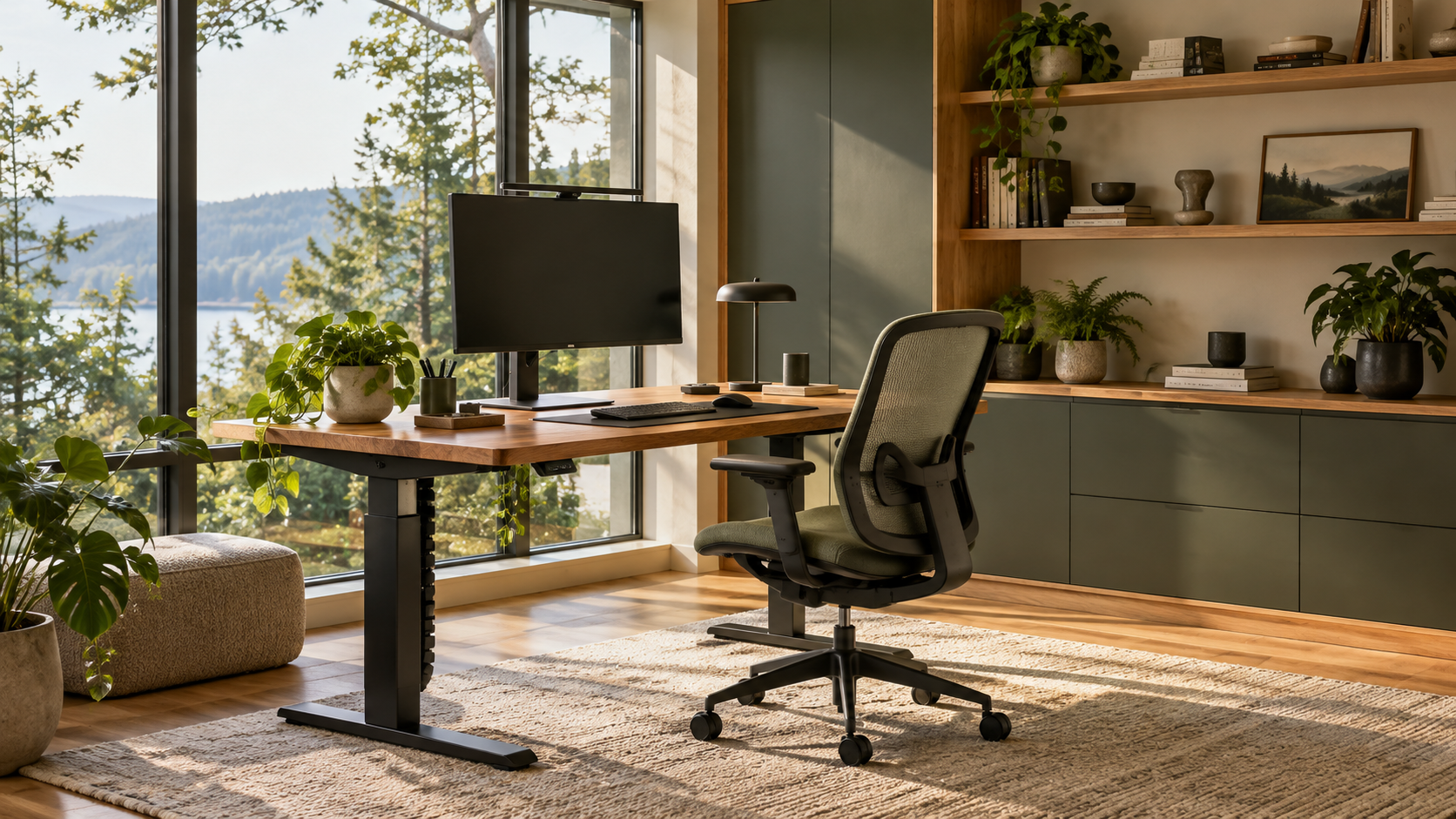
A good interior decision is rarely about buying more. It begins by noticing how a home office is used on an ordinary weekday: where hands land, what blocks movement, and which details create unnecessary visual noise. This guide looks at an ergonomic and distraction-reducing home office through that practical lens. The goal is not a room that photographs well for a moment, but one that keeps working after bags, meals, work calls, changing weather, and real routines arrive. Start by observing the room for a few days, take a few measurements, and make one improvement at a time.
Start With the Everyday Route
Before choosing a finish or a decorative object, map the actions that happen in a home office. Enter the room as you normally would and notice the first place where you pause, reach, sit, set something down, or turn around. Set the top third of the screen near eye level and keep keyboard and mouse on the same plane. These clearances are not rigid style rules; they are a way to protect comfort. When a circulation route is pinched, even a beautiful room starts to feel demanding.
Make a short list of the objects that earn permanent access and the objects that only need occasional storage. Then let the layout follow that list. In a smaller space, furniture that can perform two roles is useful only when it does not create another daily obstacle. A bench can become storage, for example, but it also needs enough open floor in front of it to be used. A large table can welcome guests, but it should not make the people who live there sidestep chairs every morning.
The most useful first change is usually the least dramatic: move one piece to recover a route, remove one duplicate surface, or give a high-use object a home close to where it is needed. Photograph the room before and after. It is easier to judge flow from a photograph than from memory, and the record makes later choices more deliberate.
Choose Materials That Improve With Use
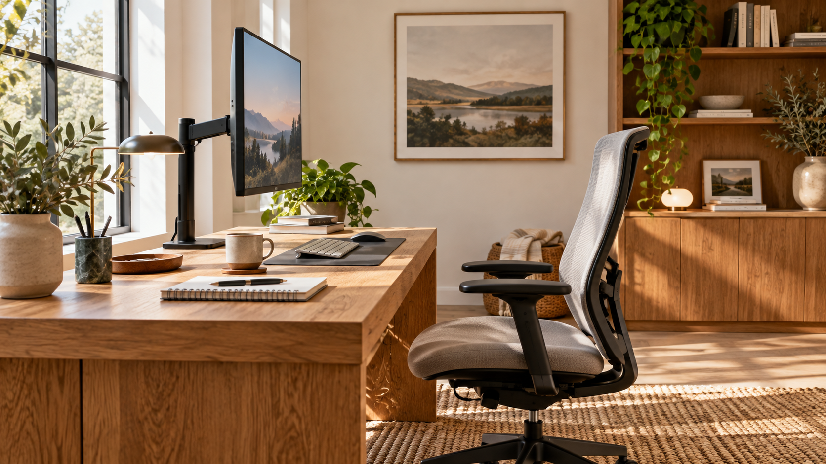
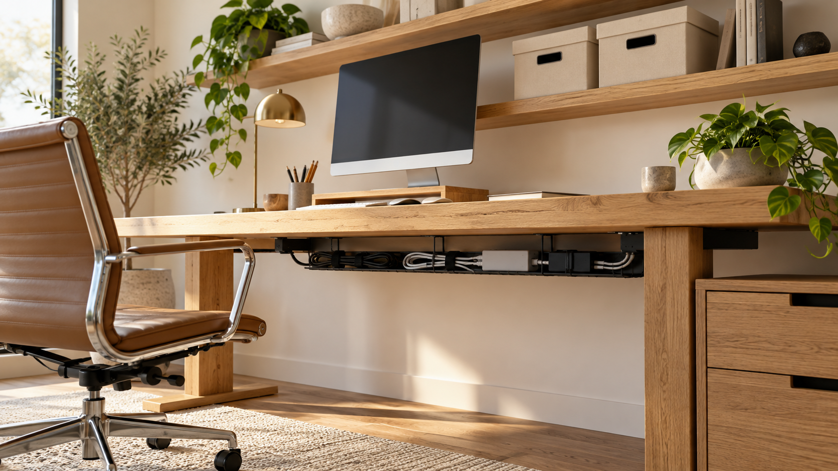
For a home office setup that protects your focus and your posture, materials should be selected for how they feel and age, not only for the first impression. A useful palette might combine a solid wood worktop, a supportive adjustable chair, matte storage fronts, and a cable tray. Each has a different job: one creates warmth, one handles wear, one softens sound or light, and one adds a little visual contrast. Repeating those material families across a few elements gives the room a settled feeling without forcing everything to match.
Ask practical questions before committing. Can the surface be repaired after a scratch? Does it require sealing, special cleaners, or protection from direct sun? Will it show fingerprints at the point where it is touched most? Sample materials in the actual room whenever possible. Daylight can make a warm stone appear cooler, and a fabric that looks calm in a showroom can read very differently beside existing flooring.
Texture is especially valuable when a room uses a restrained color palette. A woven textile, a brushed finish, or visible wood grain can provide depth without adding busy pattern. Avoid mixing many high-contrast statements in a limited space. Instead, choose one tactile feature that can carry the room and allow the surrounding surfaces to be calm. That approach is easier to update over time and helps the room feel personal rather than staged.
Build a Reset That Lasts
The final test of any design is what happens after a busy day. design the route for power and papers before choosing styling objects Create a small reset routine that takes less than five minutes: return what belongs, clear one surface, check the light, and put away anything that prevents the room from working tomorrow. This is more sustainable than relying on a once-a-week deep tidy because it keeps visual decisions connected to the life of the room.
Keep the maintenance plan visible and realistic. Save the finish information for important furniture, note the correct cleaner, and avoid using a new product without a hidden-area test. For flexible spaces, place a small basket or drawer close to the point where temporary clutter collects. For rooms used at different times of day, use dimmers, movable lamps, or adjustable shades so the atmosphere can change without a full redesign.
Finally, revisit the plan after two weeks. If something is constantly left on the floor, the storage is probably too far away. If a chair is never used, it may be taking up circulation space. The best interiors evolve through these honest observations. By improving one route, material choice, and reset routine at a time, a home office becomes more useful now and more resilient for the future.
Practical Planning Notes
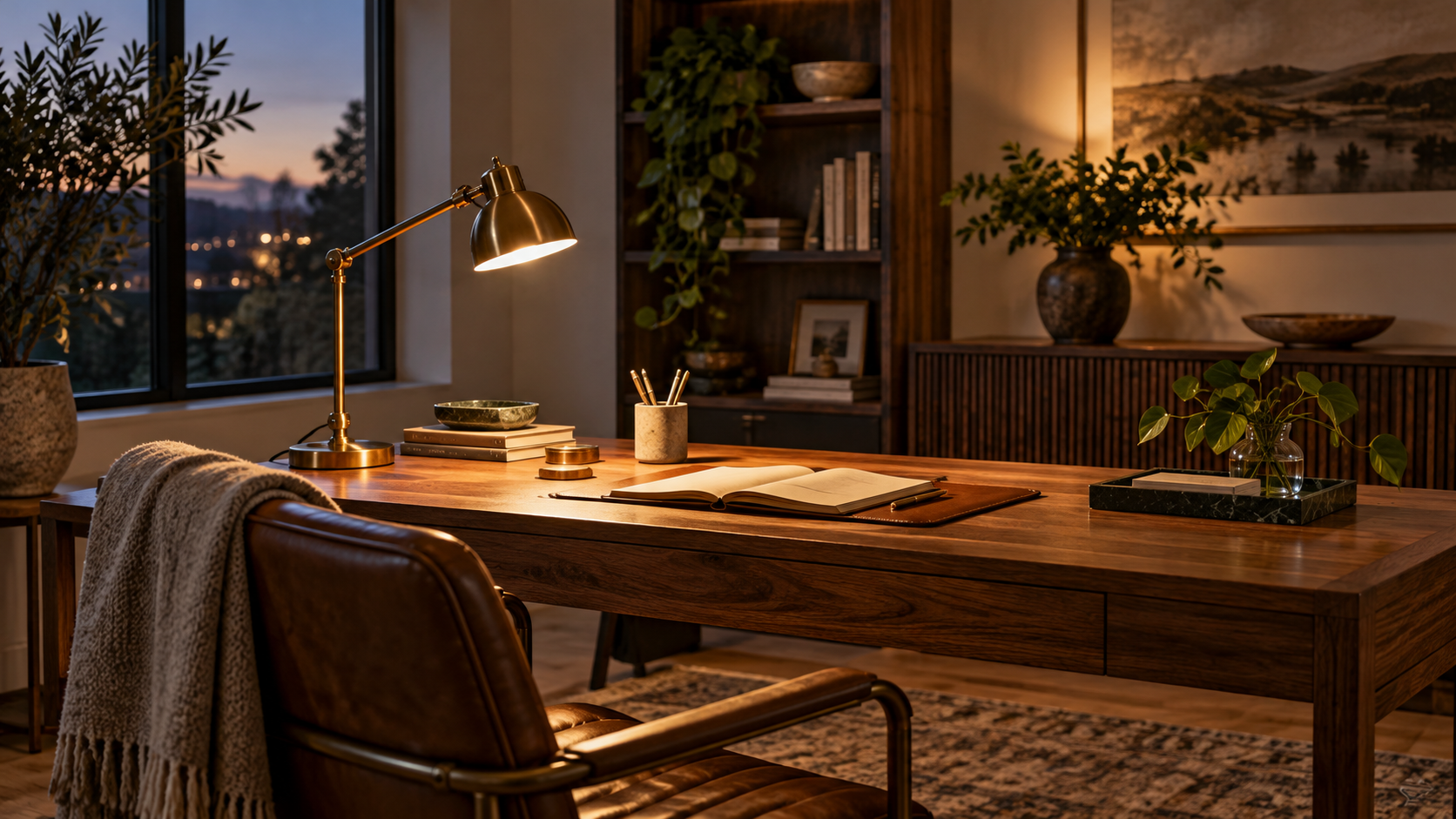
Set the top third of the screen near eye level, keep elbows near 90 degrees, and place keyboard and mouse on one plane.
Material Perspective
A solid desktop absorbs visual warmth; matte laminates can be resilient for daily work; cable trays prevent visual clutter.
Before You Commit
Test chair adjustment, screen distance, task lighting, and the cable route before fixing furniture in place.
For related, room-specific ideas, continue with the guides in this category or return to the Furnlyra home page.