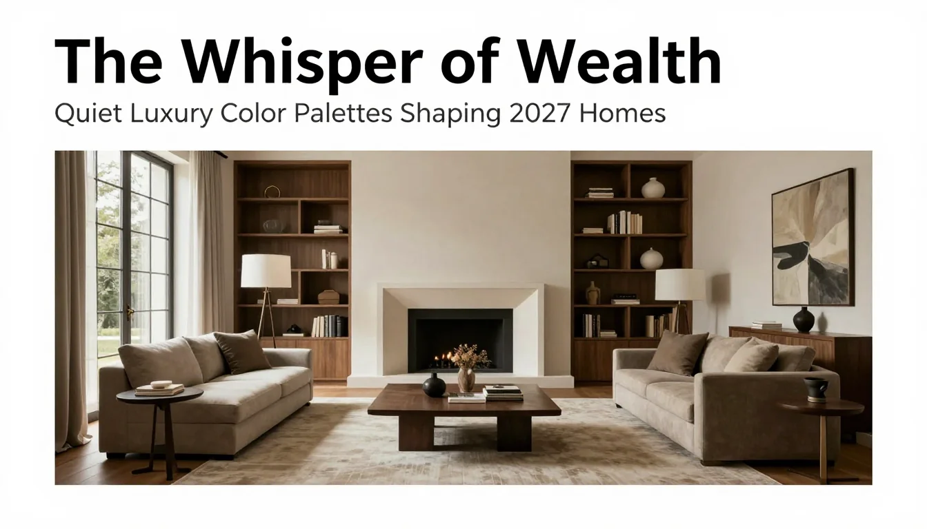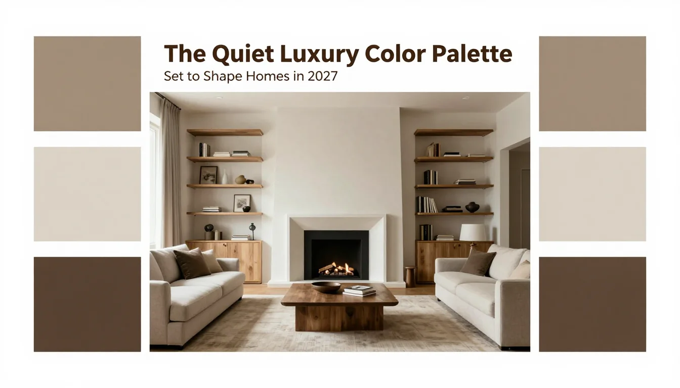
As interior design continues its evolution away from fleeting maximalism and aggressive trend cycles, a profound return to sophistication and serenity is underway. The concept of 'Quiet Luxury' has transcended merely high-end fashion; it is now defining the aspirational aesthetic of truly refined living spaces. For 2027, this luxury is not announced with bold strokes or flashy statement pieces, but whispered through nuanced color choices and masterful textural interplay. Designers are moving past the ubiquitous beige to explore richer, more complex neutrals—hues that feel deeply rooted in nature, offering both calm and enduring elegance. This shift signifies a desire for homes that function as sanctuaries; environments where comfort is inherent, not manufactured. The palettes emerging from this movement prioritize longevity over trendiness, favoring colors that age gracefully alongside their occupants, providing a timeless backdrop against which personal stories can unfold.
Earthen Subtlety and Grounded Neutrals
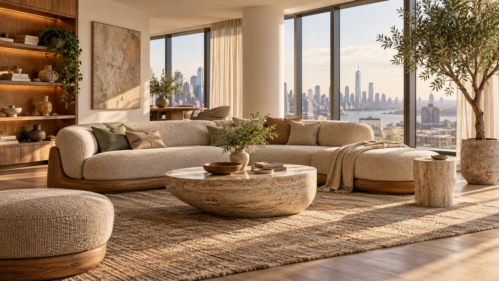
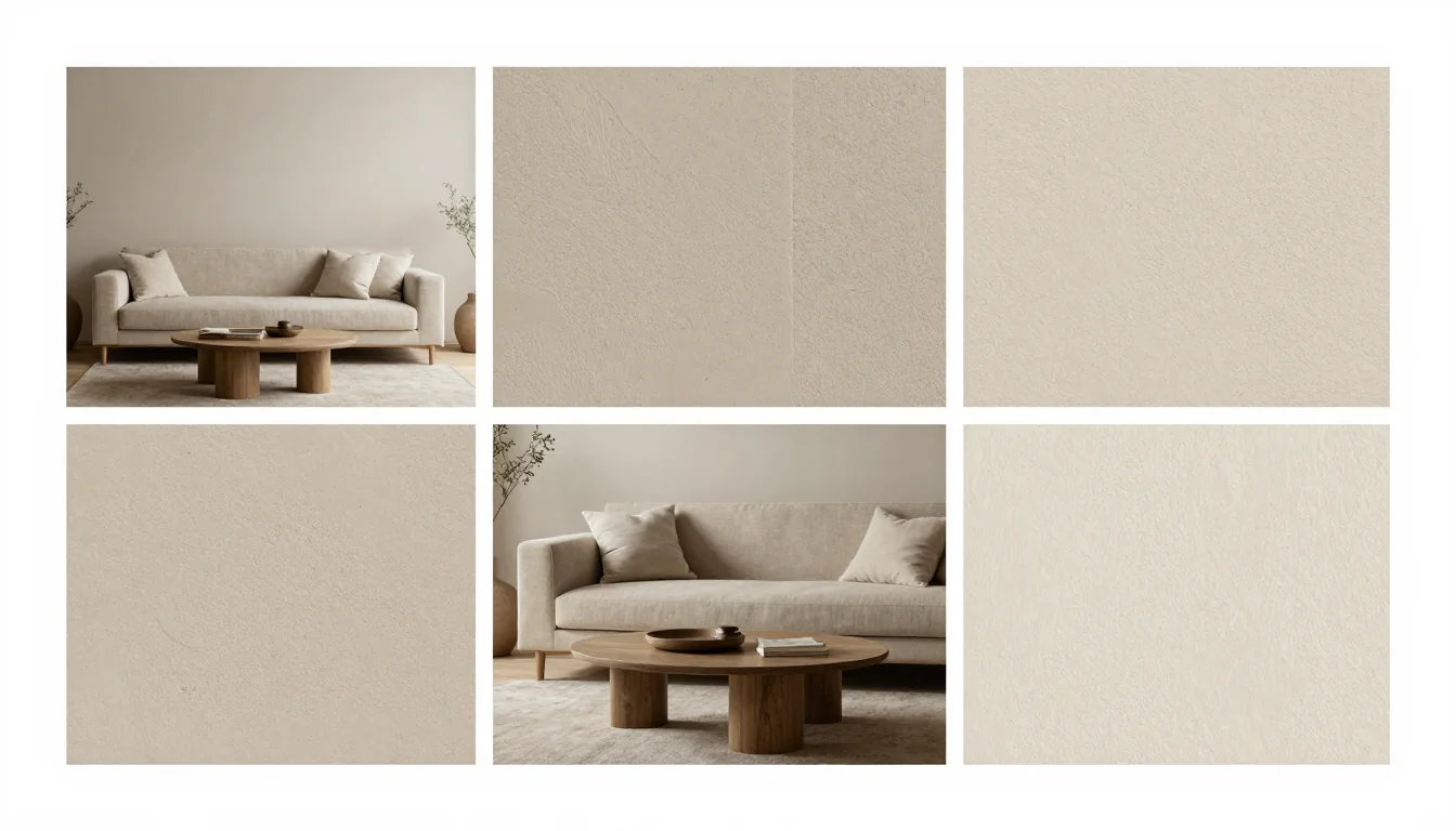
The dominant chromatic story for the coming years revolves around sophisticated neutrals infused with unexpected depth. We are witnessing a graceful transition from stark whites to complex off-whites—creams tinged with mushroom grey, bone, and oyster shell. These shades provide perfect luminosity without feeling cold or clinical. Complementing these lighter tones is an embrace of warm taupes and sandstones that evoke the texture of ancient stone or dry earth. This earthy grounding prevents spaces from feeling sterile; instead, they feel curated and organic. Furthermore, the palette integrates deep greiges—a marriage of gray and beige—which acts as a highly versatile anchor color. These muted earthen tones pair beautifully with rich woods and natural linens, allowing designers to achieve an immediate sense of permanence and understated wealth. The goal is not just coverage, but depth; each tone must carry a history, suggesting quality materials and thoughtful restraint.
The Depth of Natural Hues
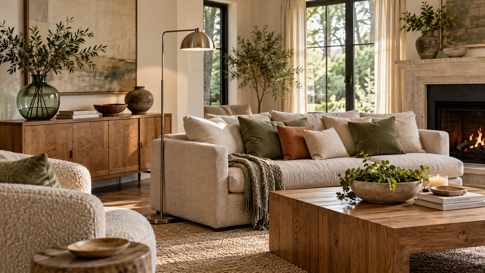
While neutrals provide the foundation, 2027 introduces subtle infusions of nature's deeper pigments to prevent monotony. These are not jewel tones meant for high drama, but muted, sophisticated shades drawn directly from botanical sources. Think sage greens that lean toward grey rather than yellow; dusty blues reminiscent of aged denim or twilight skies; and mossy olives that ground a room with forest tranquility. The key is saturation—they must be low-key and diffused. These deeper hues are most effective when used as accent walls, upholstery in seating areas, or within integrated cabinetry, allowing them to provide pockets of restful color without overwhelming the visual space. They offer a quiet counterpoint to the expansive neutrals, providing emotional resonance while maintaining an atmosphere of refined calm. This strategic use of nature-inspired depth elevates the entire composition.
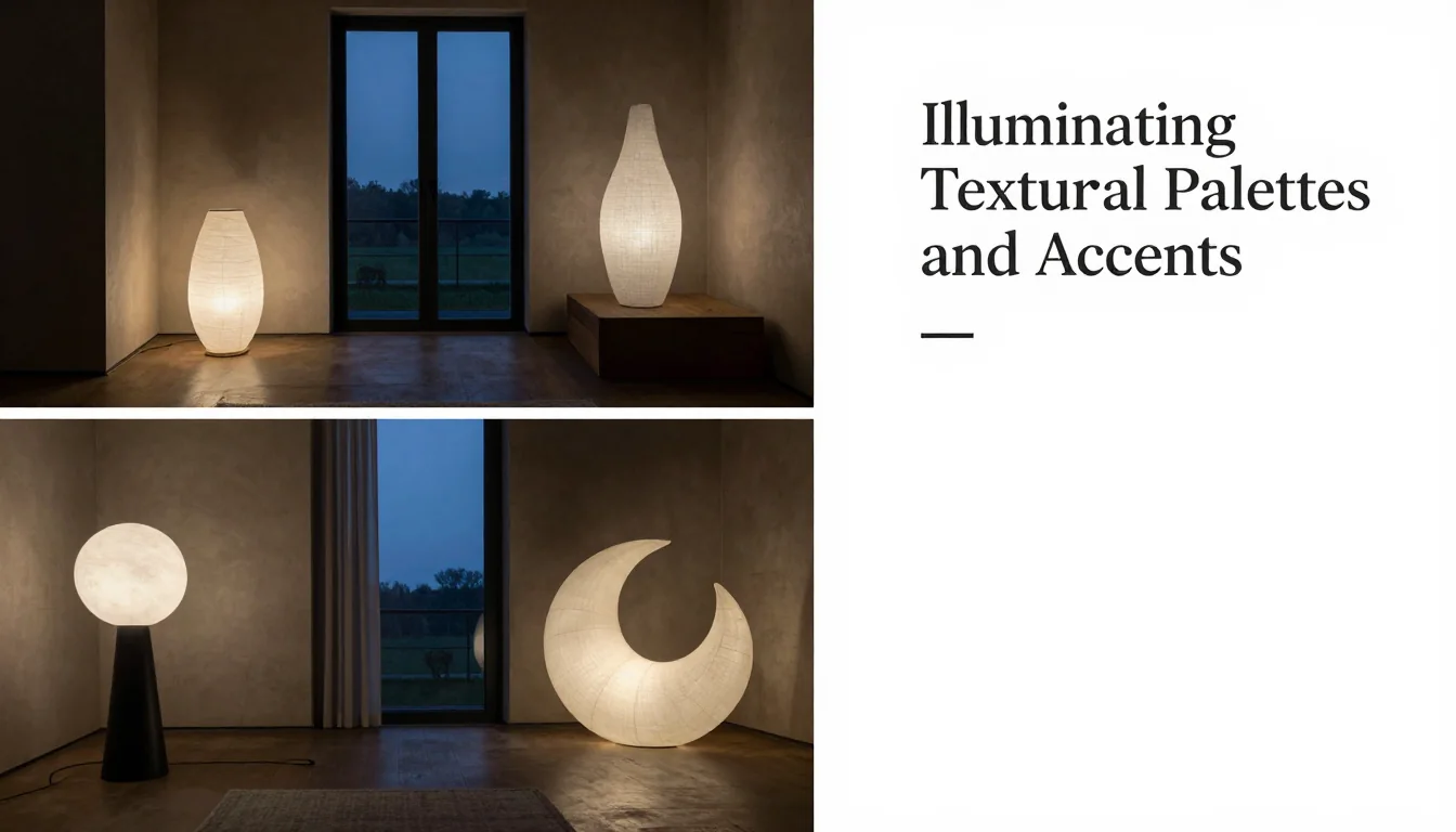
Illuminating Textural Palettes and Accents
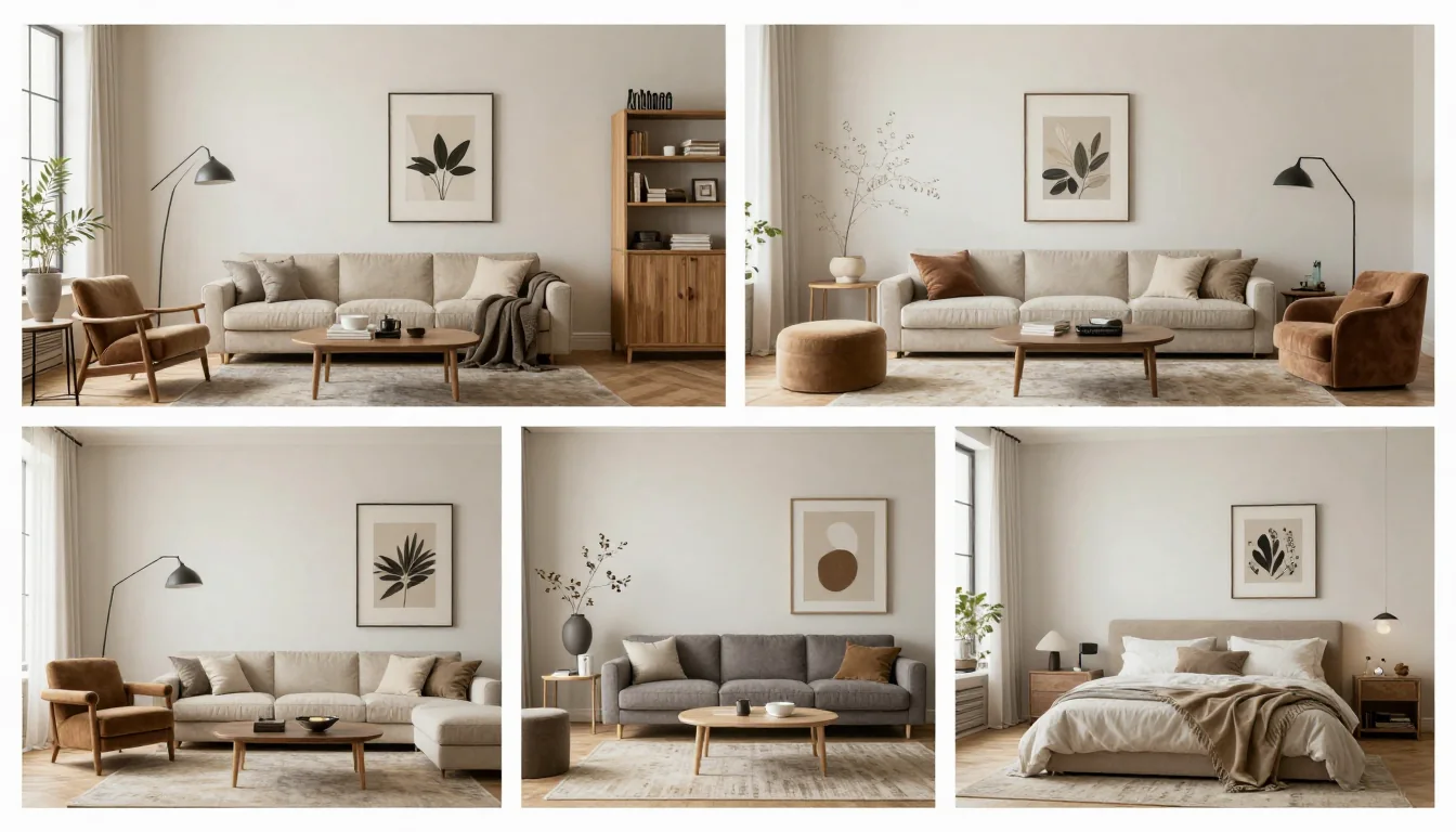
The final layer of this Quiet Luxury palette is achieved not solely through color, but through how those colors interact with texture and metallic accents. The muted base tones—the oyster shells, taupes, and dusty blues—demand tactile richness. Think bouclé fabrics, raw silk, fluted plaster finishes, and heavily woven wools. These textures catch the light subtly, giving the monochromatic scheme dimension and preventing flatness. Metallic accents are also undergoing a shift; polished brass is being tempered by brushed bronze, antique gold, and matte black hardware. These darker, more subdued metals provide sophisticated punctuation marks without screaming for attention. They introduce just enough contrast to define architectural lines and elevate simple fixtures, confirming that true luxury lies in the meticulous detail of material quality.
Ultimately, the 2027 interior landscape is defined by its refusal to shout. It champions a quiet confidence—a deliberate selection of colors and materials that speak only to those who appreciate subtlety, enduring craftsmanship, and the profound beauty found in beautifully muted tones.