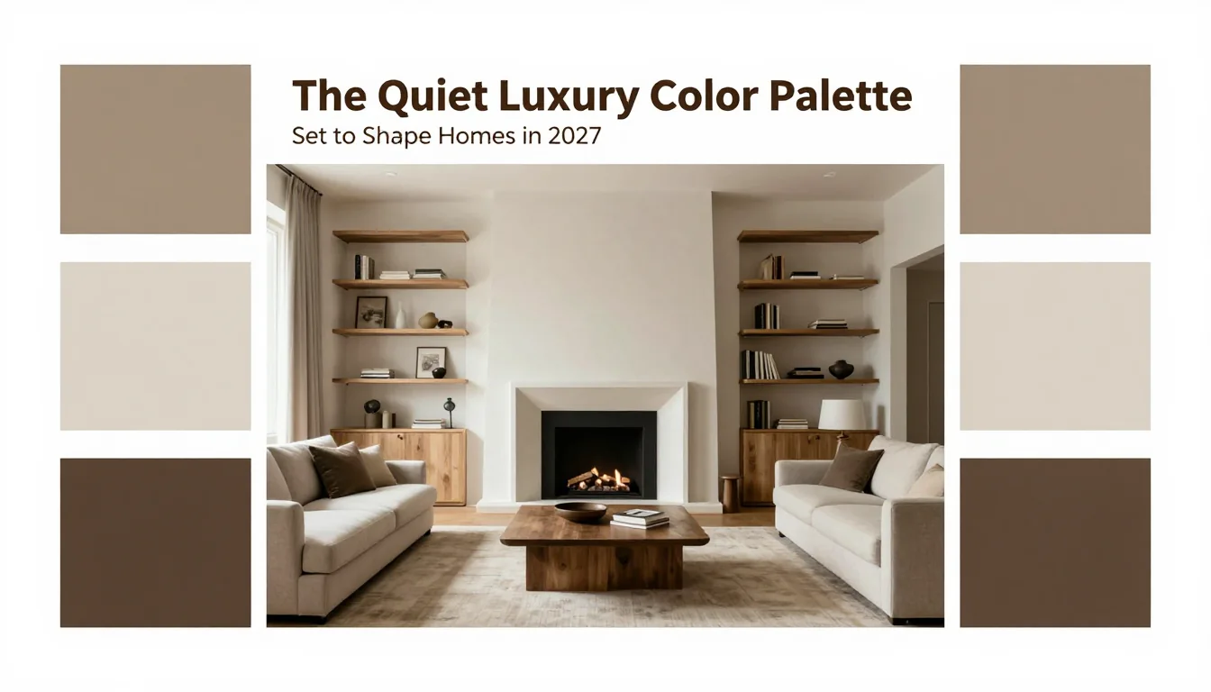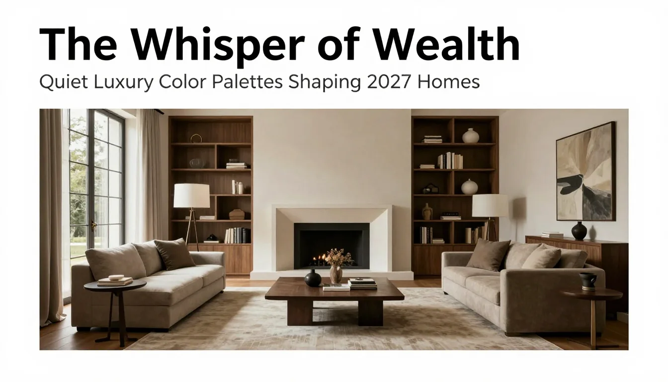
As design trends inevitably cycle, the current movement toward radical transparency and mindful consumption has fostered a profound shift in aesthetic preference. The era of loud logomania and saturated jewel tones is gracefully receding, replaced by a sophisticated reverence for subtlety and enduring quality. For Furnlyra's discerning clientele, 2027 promises to be defined not by bold statements, but by deeply considered hues—the quiet luxury color palette. This movement eschews flashiness in favor of permanence, allowing texture, light, and the inherent character of materials to take center stage. These palettes are less about painting a room and more about curating an atmosphere of serene confidence; they speak softly of taste and uncompromising quality.
The Supremacy of Elevated Neutrals
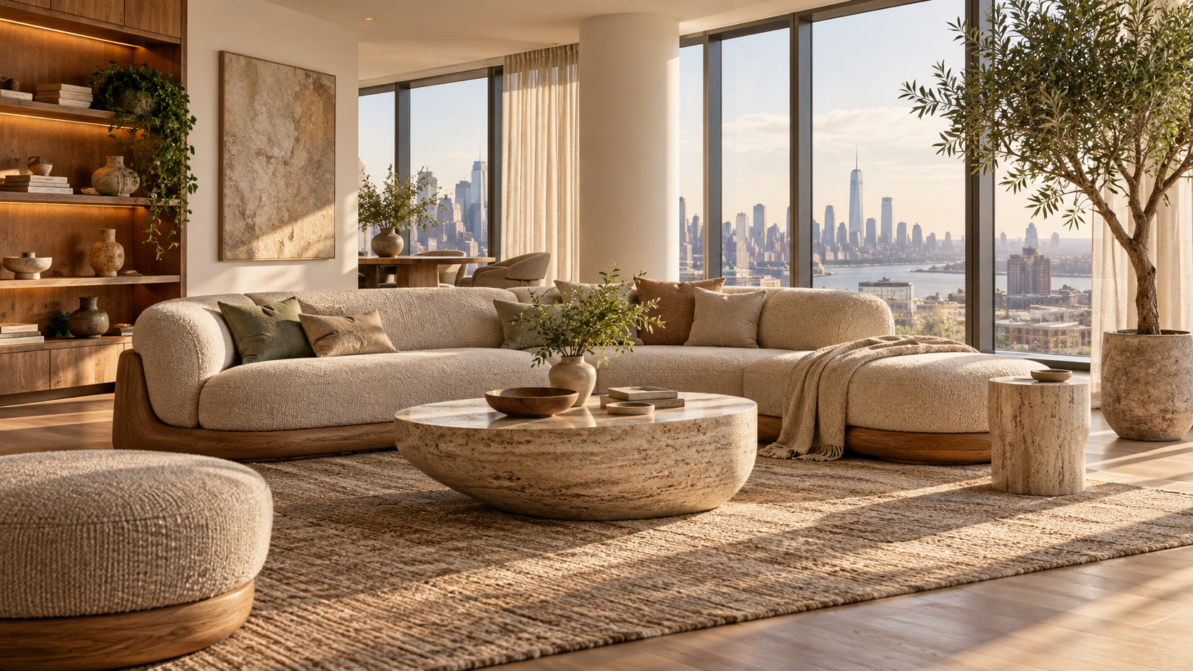
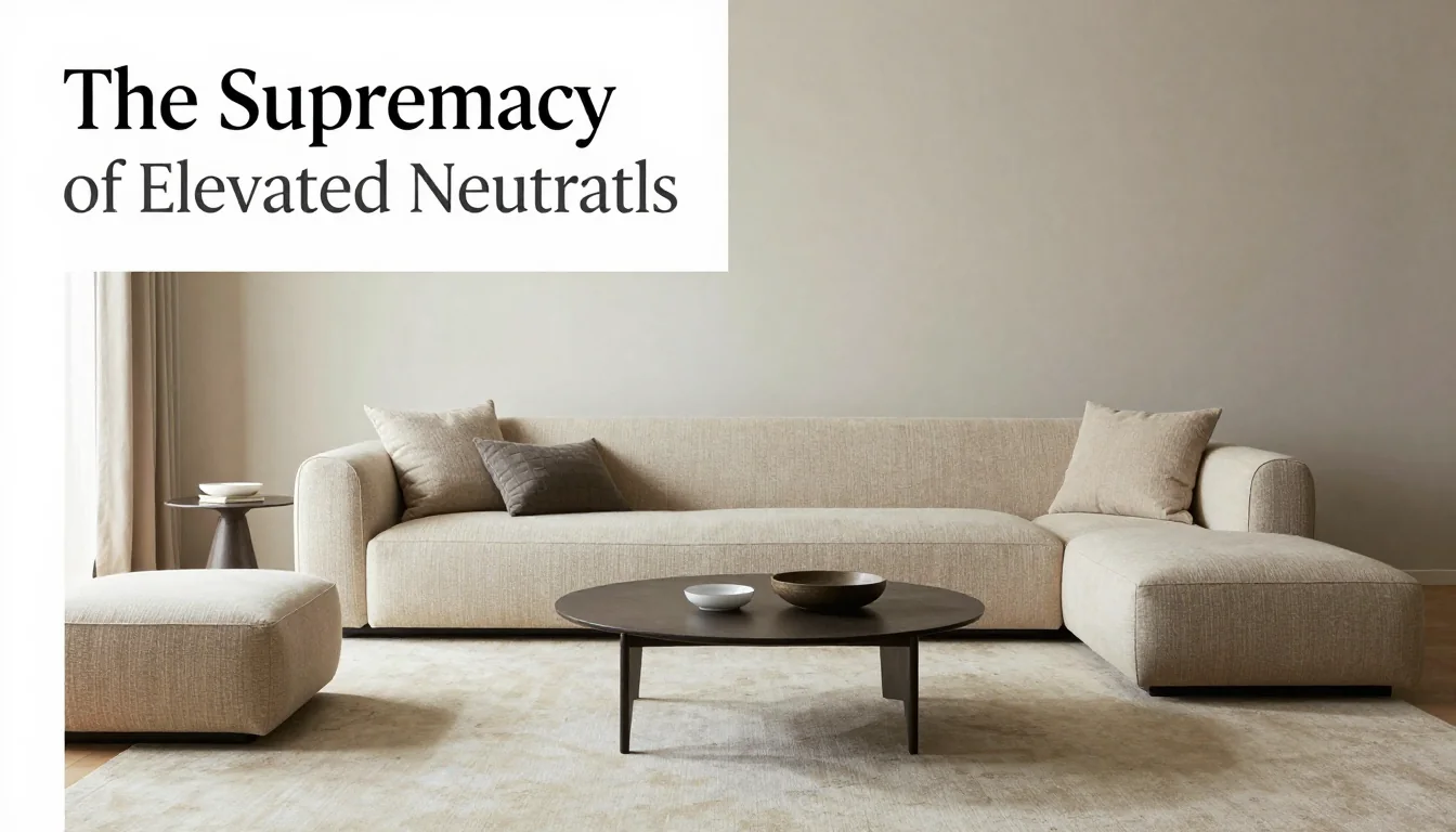
The bedrock of the 2027 design landscape rests upon highly nuanced neutrals—colors that exist at the intersection of warmth, coolness, and shadow. Gone are the stark whites that demand perfection; their successors are creamy ivories, mushroom grays, and warm taupes, all engineered to interact beautifully with natural sunlight throughout the day. These sophisticated shades act as a canvas, providing a deeply comforting backdrop against which sculptural furniture and artisanal objects can truly shine. The key differentiator here is not just the hue itself, but its finish; matte, velvety paint treatments and richly textured fabrics in these tones absorb light rather than reflecting it aggressively, lending an immediate sense of groundedness and tranquility to any space. Implementing this palette means prioritizing tactile experiences—think linen upholstery, travertine stone, and hand-thrown ceramics—where the subtle variations within the neutral color family become the ultimate design feature.
Earthy Depth: The Natural Palette Shift
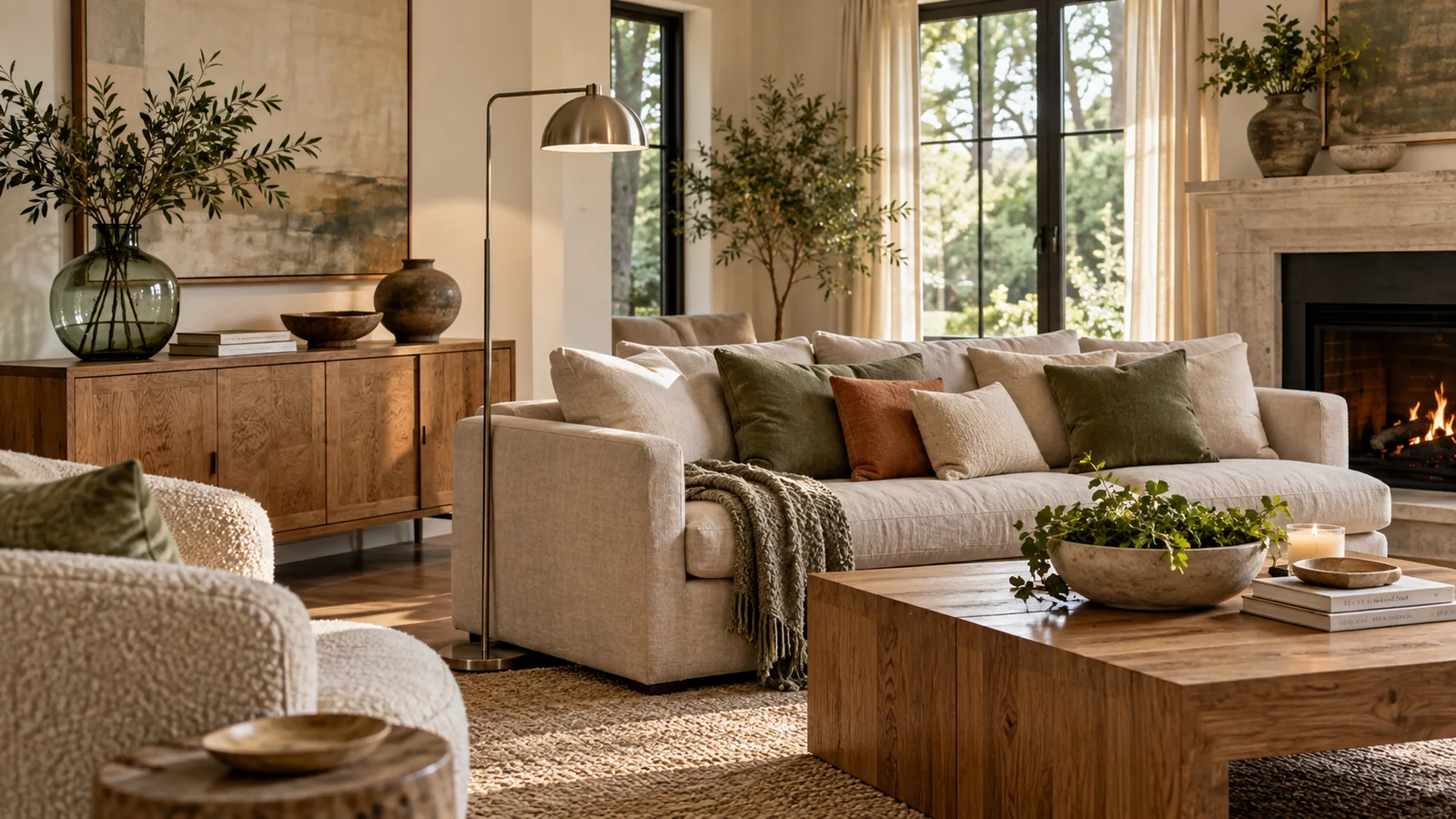
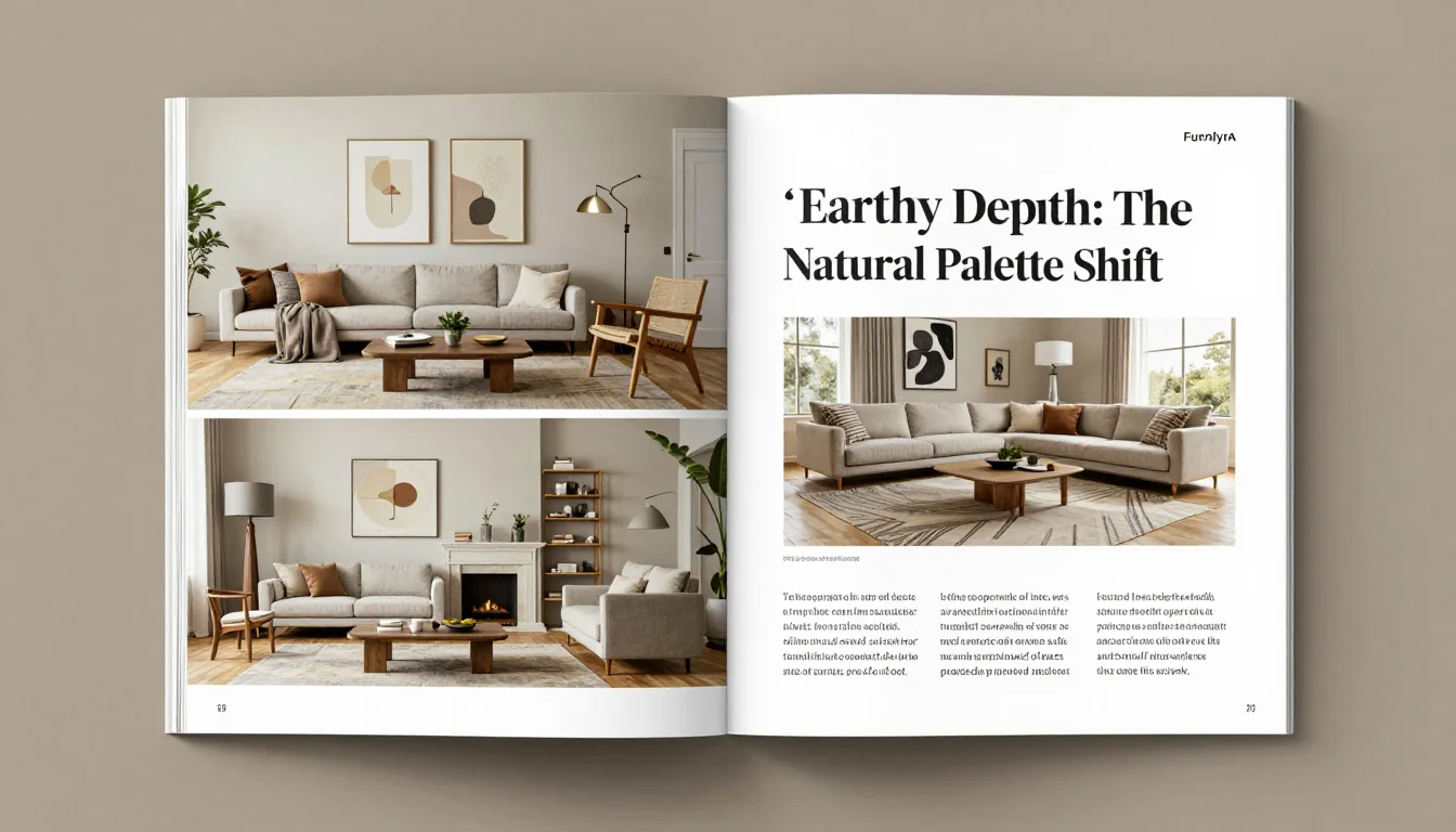
The growing global emphasis on biophilic design is manifesting in a sophisticated embrace of muted earth tones. This trend moves beyond simplistic beige to incorporate complex shades inspired by natural geology and foliage. Pale sage, moss green, oxidized terracotta, and deep slate are permeating interiors, acting as gentle anchors that connect the home directly to its environment. These colors possess an inherent patina—a suggestion of age or weathering—which lends them gravitas and timelessness. Rather than using these deeper shades on entire walls, designers are employing a strategic layering approach: painting one accent wall in a rich, muted sage, juxtaposing it with cream-colored plasterwork, and grounding the space with furniture upholstered in mushroom gray velvet. This intentional modulation prevents the earthy tones from feeling rustic; instead, they achieve an elevated, almost monastic quality that speaks to careful curation and sophisticated restraint.
Anchoring Moments: Strategic Hues for Drama
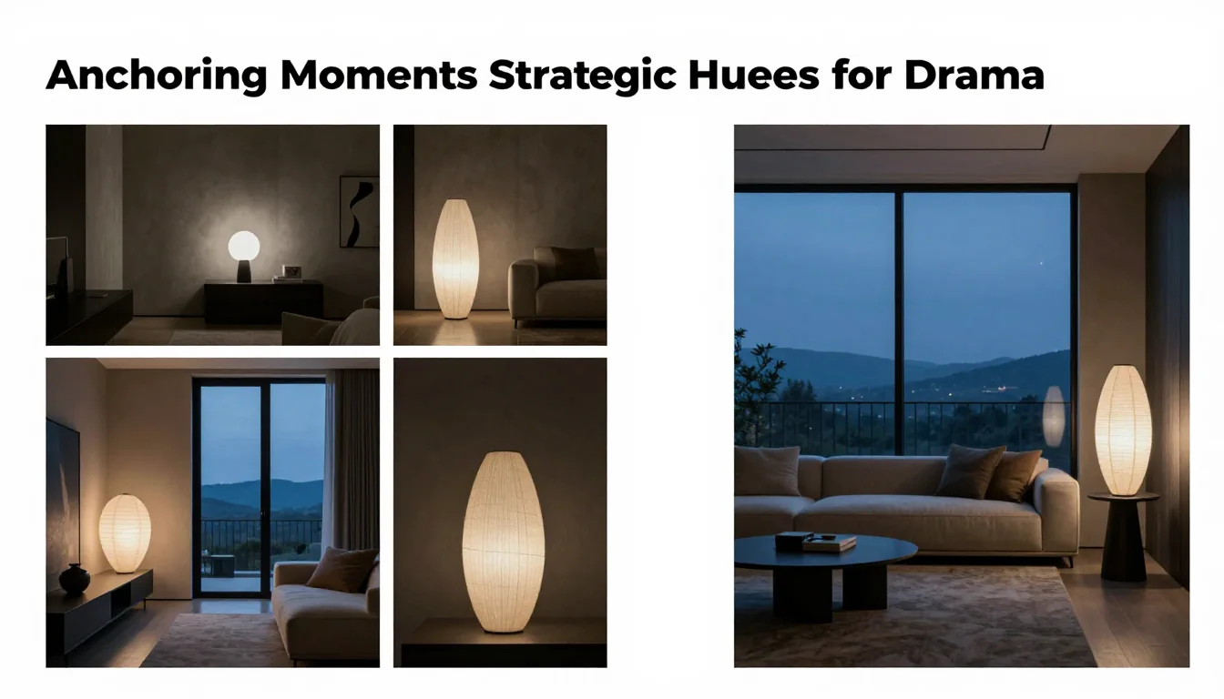
While quiet luxury champions subtlety, it does not advocate for monotony. The sophistication of this palette is demonstrated in how minor doses of deeply saturated, yet muted, colors are deployed to create dramatic focal points. These anchoring hues are rarely primary; they are often oxidized or desaturated versions of traditional strong tones. Consider a deep charcoal used sparingly on cabinetry, a midnight blue that leans heavily into indigo and gray, or a dusty plum that avoids being overly saccharine. When these rich accents are introduced, they must be framed by the surrounding neutrals—the pale taupes and ivories act as breathing room, allowing the darker shade to possess maximum impact without overwhelming the eye. This strategic use of shadow color ensures that the space feels curated rather than cluttered, achieving a powerful sense of depth and intentionality.
The 2027 palette is a declaration against fleeting trends; it is an embrace of enduring elegance. It suggests a consumer who values craftsmanship over commercial hype, prioritizing comfort and understated beauty above all else. By weaving together these nuanced neutrals, rich earth tones, and strategically placed anchors, homeowners can cultivate interiors that are not merely decorated, but truly lived in—spaces defined by a quiet, confident splendor.