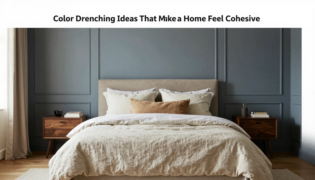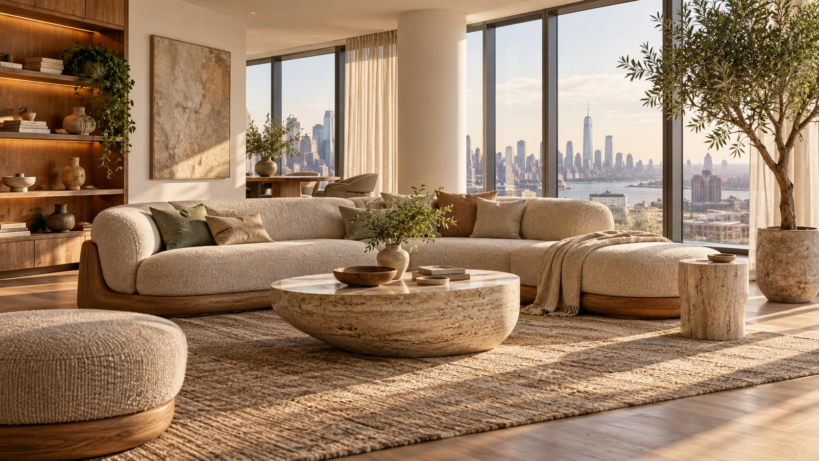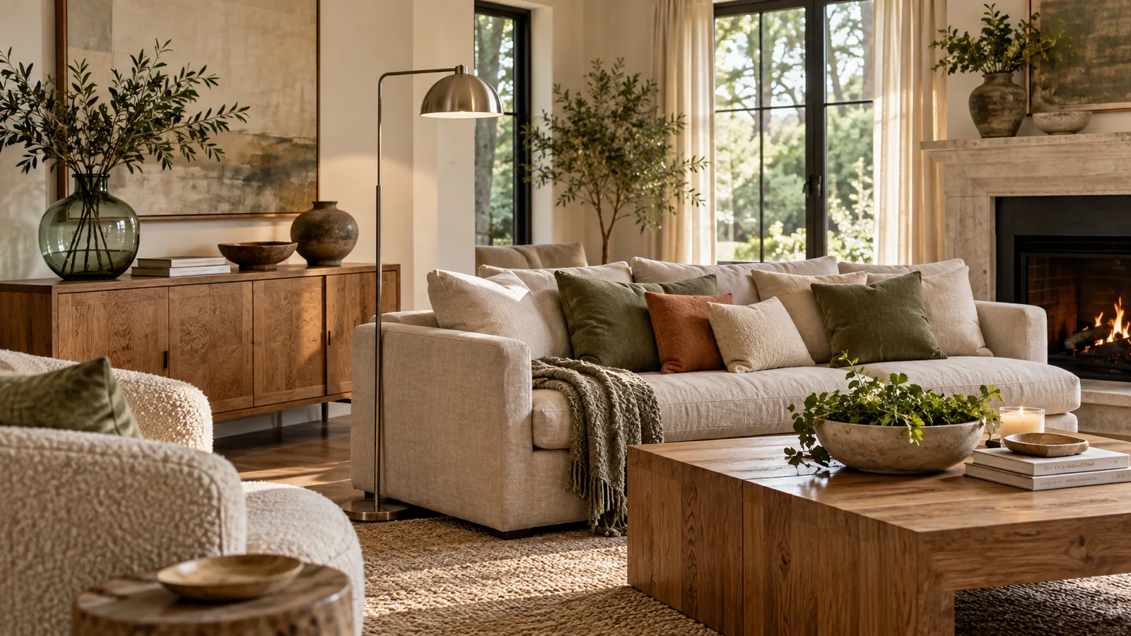
Monochromatic schemes—the deliberate use of a single color family across an entire space—have transitioned from a niche trend to a cornerstone of modern, sophisticated interior design. The practice, often called 'color drenching,' involves painting the walls, trim, doors, and even some furnishings in varying shades or tones of the same hue. While this approach promises unparalleled visual cohesion, it carries an inherent risk: the potential for the space to feel monolithic, oppressive, or heavy. However, when executed with thoughtful intention, color drenching creates a cocoon-like sanctuary—a perfectly unified environment where every element feels intentionally placed and harmonious.
The secret to successfully navigating this bold design strategy lies not just in choosing the perfect shade, but in understanding how light interacts with that shade, and crucially, introducing variation through material and texture. By treating color as a foundation rather than an end point, designers can achieve drama and depth without sacrificing airiness or lightness.
Choosing Colors with Sophisticated Depth
The first critical step is moving beyond basic primary colors and selecting shades that possess genuine complexity. Heavy-handed use of stark black or overly saturated jewel tones can quickly overwhelm a room. Instead, opt for complex neutrals—think muted sages, warm greys with beige undertones, deep terracotta, or sophisticated dusty blues. These nuanced hues have enough inherent depth to absorb light beautifully while remaining airy.
When selecting your anchor color, consider the natural light in the space. A cool grey that appears crisp under bright midday sunlight might look muddy and heavy during a dim evening. Conversely, a warm taupe that feels welcoming in soft morning light can appear dull when bleached by strong afternoon rays. Always test samples at different times of day to ensure your chosen color maintains its intended character throughout the twenty-four hours. The ideal depth is one that allows shadow and highlight to play across surfaces, giving the room dimension even when painted uniformly.
Carrying the Tone Across Key Surfaces
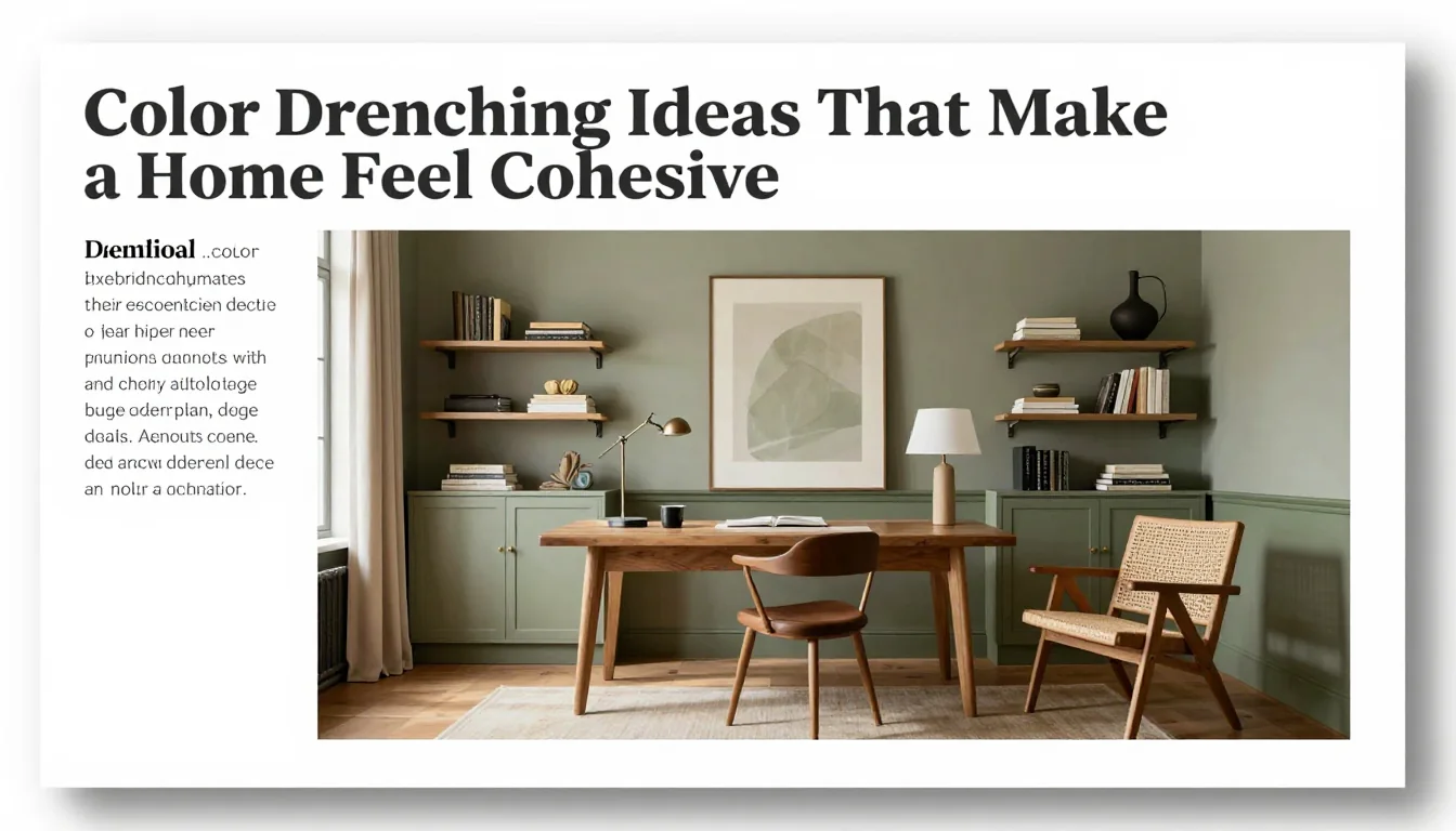
True color drenching requires commitment; it means applying the same tonal language consistently from floor to ceiling. This unified application extends beyond just paint—it influences textiles, cabinetry, and hardware finishes. By matching the undertone of your wall paint in upholstery fabrics or matte lacquer on custom millwork, you create a seamless visual flow that is inherently calming.
However, consistency should not translate into sameness. If every piece were exactly the same color and finish, the room would become flat. Instead, use varying saturations and finishes within the chosen family. Pair a deep, matte wall paint with trim finished in an eggshell sheen to catch light subtly, or incorporate furniture upholstered in a slightly lighter shade of your main color. These subtle shifts in tone prevent the eye from glazing over and maintain visual interest.
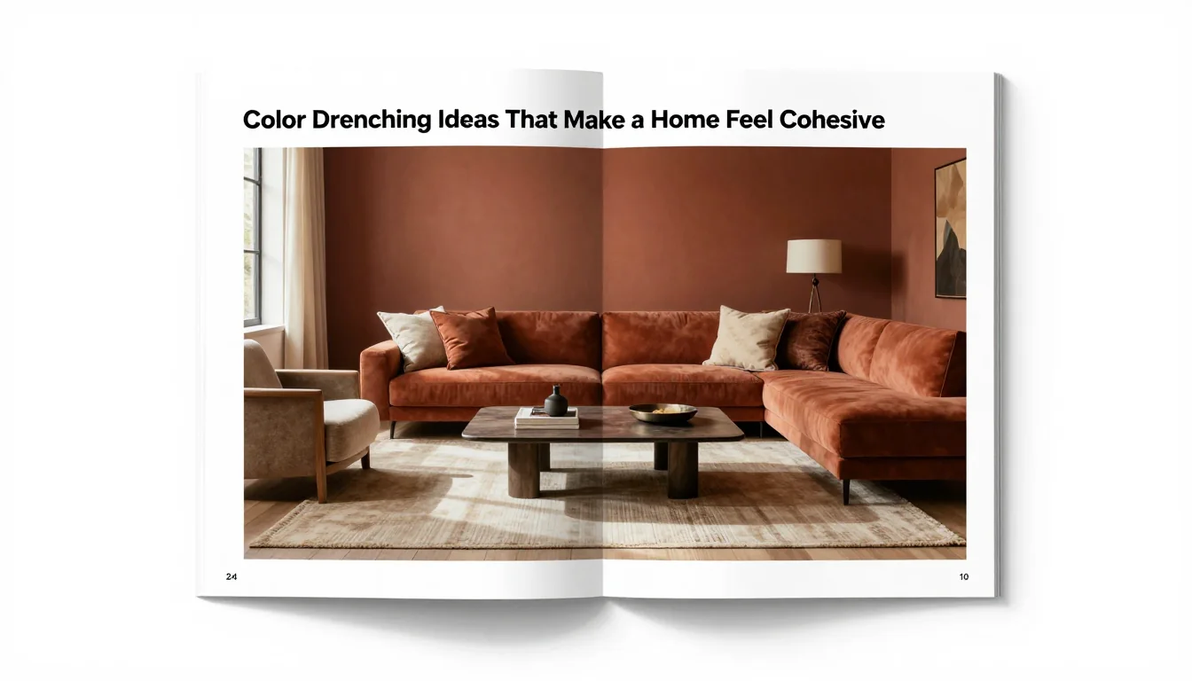
Using Texture to Keep the Room Alive
The ultimate antidote to heaviness in a monochromatic space is texture. Since you are limiting the palette, you must maximize the tactile experience. This means layering materials that react differently to light and touch—a smooth velvet sofa against rough-hewn linen curtains; polished stone hearths juxtaposed with matte painted cabinetry.
Introduce textural variation through accessories and architectural details. A woven jute rug grounds a room saturated in deep blue, providing an organic contrast. Plaster walls offer a softer visual texture than smooth drywall, while metallic accents—a brass light fixture or silver mirror frame—provide necessary pops of reflective energy. These tactile interventions ensure that the eye is always moving across varied surfaces, preventing the single color from becoming a heavy, impenetrable blanket and transforming the space into an elegantly layered sanctuary.