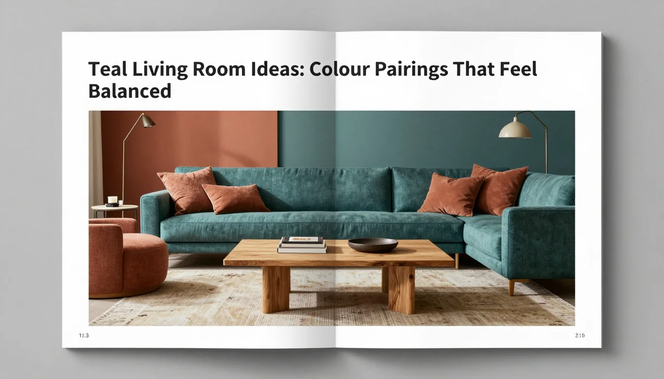
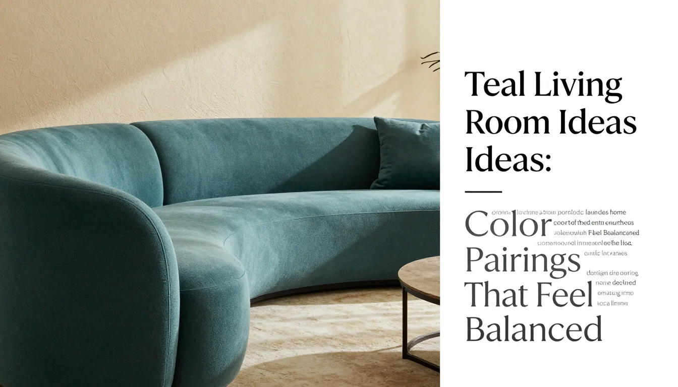
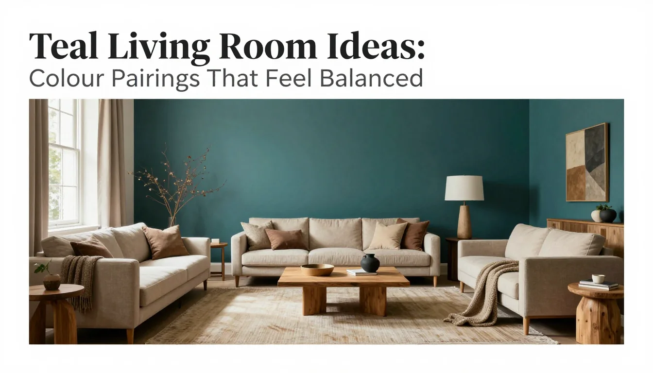
Teal is a deeply resonant colour, capable of lending sophistication and calm depth to any room. However, its intensity requires careful pairing; without grounding elements, it can feel overwhelming or too cool. Achieving a balanced teal living space involves introducing warmth through natural materials and light neutrals. This guide explores how combining rich teal with warm white, terracotta, and varied wood tones creates a harmonious environment that feels both modern and deeply rooted.
The Foundation of Calmness: Teal, Warm White, and Wood
When integrating a strong colour like teal, the foundational palette must be light and breathable. Pairing deep teal upholstery or feature walls with warm white acts as an immediate visual relief. Unlike stark brilliant white, a creamy or ivory off-white provides subtle warmth that prevents the cool undertones of the teal from feeling clinical or cold. This neutral serves to lift the weight of the colour, allowing it to feel rich and luxurious rather than heavy or dominating. The goal is to create contrast without creating visual tension, ensuring the room feels airy despite the saturated hue.
To further ground this foundation, introduce varied wood tones. Opting for lighter woods—such as bleached oak or natural beech—keeps the space feeling open while adding necessary organic texture. These materials should appear in furniture legs, shelving units, and coffee tables. The grain of the wood introduces a complex visual pattern that breaks up the solidity of the painted walls and textiles. A key consideration is daylight testing; observe how your chosen teal interacts with both cool morning light and warm afternoon sun. Different lighting conditions will shift the perceived depth and warmth of the colour considerably.
A crucial tradeoff to consider here is saturation versus lightness. If you choose a very deep, almost navy teal, you must lean heavily into the lighter woods (e.g., pine or birch) to prevent the room from becoming claustrophobic. Conversely, if your teal has more blue-green vibrancy, a slightly richer, mid-toned wood like walnut can provide necessary gravity and visual weight. Ensure that the warm white used is truly creamy—it should have a slight yellow undertone—to harmonize with the natural oils found in quality wooden finishes.
Introducing Earthy Density: Terracotta Integration
Terracotta acts as the essential heat source in this palette, providing the necessary earthy counterpoint to the coolness of teal. This warm, sun-baked clay tone should be used sparingly; it functions best as an accent colour rather than a major structural element. Think about smaller items that can introduce density and texture—vases, decorative ceramic bowls, woven floor cushions, or small side tables. By keeping terracotta contained, you allow the eye to rest on its rich warmth without being overwhelmed by the intensity of both the teal and the clay.
The integration should prioritize matte finishes over glossy ones. A highly polished terracotta piece can catch light sharply, creating a jarring contrast with the soft textures typically associated with living room comfort. Matte ceramics absorb light, allowing the colour to feel grounded and ancient. This tactile quality connects the modern vibrancy of the teal with timeless, natural elements. When placing these pieces near wood surfaces, ensure the grain direction contrasts slightly with the terracotta’s solidity to maintain visual interest.
A realistic tradeoff when employing terracotta is its tendency to pull the overall palette toward a Mediterranean or Southwest aesthetic. If your design intention leans more contemporary and minimalist, use only single, highly geometric terracotta accents. If you desire a maximalist, bohemian feel, allow the tone to appear in textiles—such as throw pillows or area rugs—but ensure these are balanced by generous amounts of warm white space to maintain an overall sense of restraint.
Harmonizing Accents and Material Care
Achieving ultimate balance relies heavily on restrained accents. Beyond the primary colours, introduce metals that bridge the gap between cool teal and warm terracotta—think brushed brass or antiqued copper rather than high-shine chrome. These metallic touches should be used in lamp bases, picture frames, or small hardware elements. They reflect light warmly, reinforcing the overall feeling of comfort while providing a refined gleam. The key here is distribution; scatter these accents subtly across different levels of the room (tabletop, shelf, floor) rather than grouping them into one dominant cluster.
Material care is essential for maintaining this complex palette over time. For wood furniture, regular conditioning with furniture oil or wax is necessary to prevent drying and cracking, especially in rooms prone to temperature fluctuation. These oils not only nourish the grain but also deepen the warmth of the tone, enhancing its connection to the terracotta elements. Textiles, particularly those dyed teal, should be professionally spot-cleaned immediately when spills occur; strong dyes can bleed if exposed to moisture for too long.
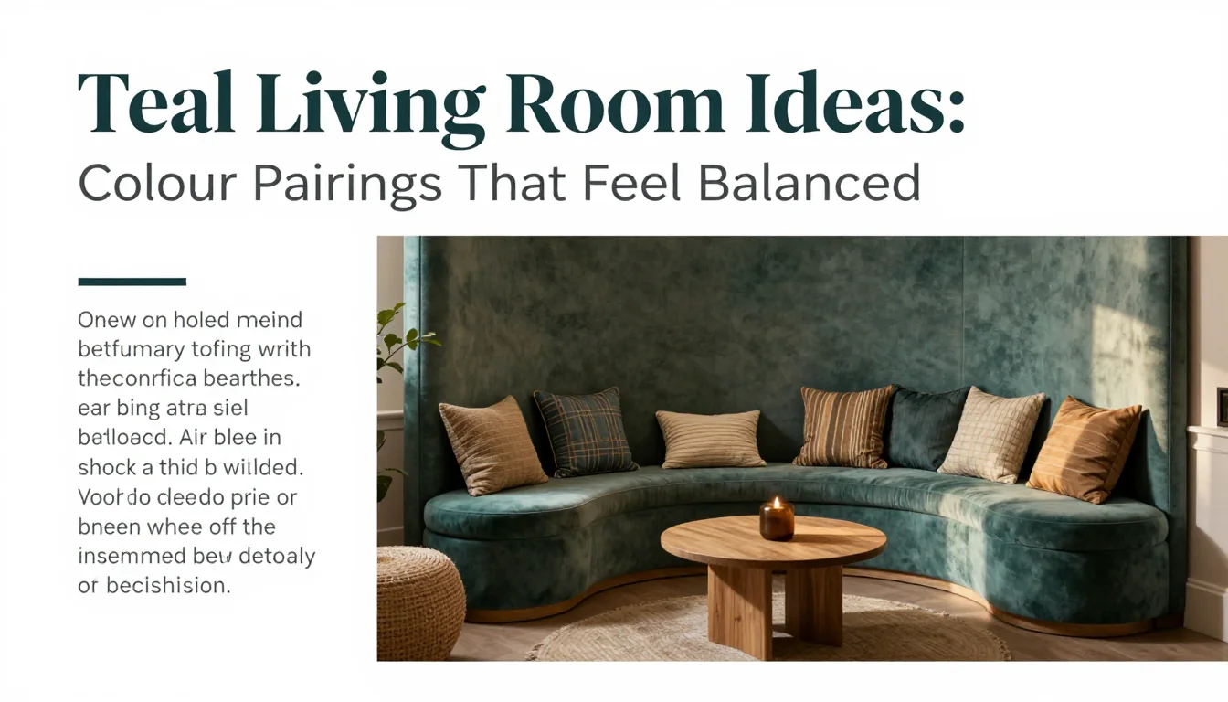
Finally, consider living plants as natural accents. The deep green tones found in lush foliage complement both teal and terracotta beautifully, adding an organic dimension that is inherently restful. These biophilic elements serve as a soft transition between the saturated colours and the neutral backgrounds. Ensure all porous materials—such as unglazed ceramic pots or untreated wood surfaces—are protected from direct watering to prevent staining; always place them on protective trays or coasters.
Practical Planning Notes
Leave roughly 30–36 inches for a main circulation path and 14–18 inches between a sofa and coffee table.
Material Perspective
Wool and performance linen bring texture; leather is easier to wipe but benefits from controlled sunlight.
Before You Commit
Confirm seating, side tables, reading light, and a reachable surface for every main seat.
For related, room-specific ideas, continue with the guides in this category or return to the Furnlyra home page.